
I started this quilt before May 9, 2011 (my memory is not that good....I checked my blog posts):

My intention at the time was to make a quilt for myself and use some of the fabrics I had in my stash. I had a Bali Pop that I liked and I really liked this pattern, Hugs and Kisses, by Jaybird Quilts. Simple and manageable intention right? Where did I go astray?
I made all the blocks and that went well. Then I joined all the blocks and that went well. I had one seam left to join the two halves of the top together and yet it has hung on my quilt wall for months. MONTHS!!! Just waiting for one seam.
You know what it was? I didn't like how some of my blocks met, they were off here and there so I put it aside. Perfection got in my way of finishing a quilt for myself. Not a quilt for some big show.....just a quilt to snuggle under for myself.
I have a confession to make: I'm not the best piecer in the world. There....it's out....I feel so much better. Waldo has even offered to give me some lessons on better piecing. No big deal right? You know what I tell other people, including my daughter?
"Just start, have fun and let it be what it turns out to be."
Great advise ay? I think it is time I start taking it myself. Acceptance is the word I choose to define my year and I'm guessing I'll be revisiting the practice of ACCEPTANCE over and over again.
I can accept that I'm not a great piecer and I can accept that my quilt will not be show quality and I also admit that if you look for the mistakes, you'll find them. Somehow finishing a quilt seems so much more exciting than wrangling with all these "issues" so I finished the last seam yesterday.

Now, to choose the borders and binding. Here I go again....frustrating the tar out of myself. I want the quilt to be pleasing to my eye when it is finished. I'm not the best at choosing colors....so....I went through my stash to see what I had (after all I intended to use my stash...not buy more fabric). Here are some options:

Exhibit A...LOL

Exhibit B

Exhibit C

Exhibit D

Exhibit E
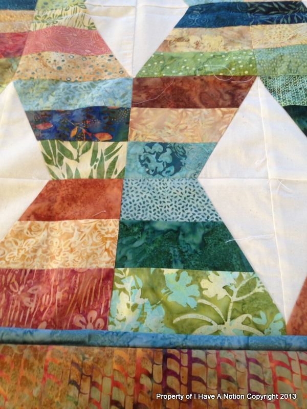
Exhibit F

Exhibit G

Exhibit G
And these are only the options I want to show you....am I nuts or what? I need more color confidence is what I need. After I publish this post, I'm going down and getting my color wheel....it will tell me which one's work best together. I'd also like to know your opinion.....someone needs to educate me today :)
Perfectly Imperfect Smiles,
Kelly
Folks, I've seen this in person and it's not as bad she says it is. I like the first Option G with the brick red and blue. I love contrast.
ReplyDeleteBest piecing advice I got was from Kaye England on craftsy.com. Take her class "Piecing the past" (or something like that). That class is worth it's weight in gold.
I love the quilt! What a great idea! I am doing a couple of quilts in Bali Pops, and will have left overs. This would be perfect to use up those scraps!
ReplyDeleteI think for a border, I like exhibit C the best!
I think C and the 1st G are the same. This provides a calming, solid framing. I do however personally like the bottom side of B or E or F because the busy batik fits with the rest of the quilt and keeps it feeling scrappy. Choose what feels good to you! I find these types of photos definitely help.
ReplyDeleteLol...you are almost there..I like E ... right now! Lol!
ReplyDeleteThe bottom one in exhibit B is my choice.
ReplyDeleteI like "C" and I just have to tell ya. Your blocks(in picture "C") remind me of frog legs.Crazy,huh.
ReplyDeleteYou can see by people's varied choices, it really doesn't matter what you choose. In fact, "It Really Doesn't Matter" is an excellent motto for quilting....whatever you choose will be beautiful, cuddled under, and loved, so don't stress.....
ReplyDeletePersonally I like
ReplyDelete* "D"the blue/red/blue combination as my first choice and
* last photo of green/wide blue as my second choice...
the diamonds really "pop"out of the pattern... it's a quilt that would suit both a classic or contemporary room, so great pattern!
You have a lot of choices. Before deciding, I'd look at the quilt and see what you see. And think about what colors YOU like, and where it will go. Which color will make you feel happiest when you see it. I'd go with a color you like (among your choices). Like blue if it is your favorite color in general. Also decide if you want the quilt to be bright or quiet, and pick accordingly on the border, then pick the inside border that flatters the outside border you've chosen--I'd use a bit of an accent color. And don't forget the binding--that's another color choice. :)
ReplyDeleteI like 'B' - the greens seem to bring out the best in the other colors! But that's just me! Your quilt is beautiful and I am so glad you are getting it completed!~
ReplyDeleteE and F are my favorites. I would have to toss a coin on those two!
ReplyDeleteYou choose Hon because it is your quilt and you should be proud of it.I love all the colors in the quilt and I don't think you will go wrong,just choose what you love and have fun.
ReplyDeleteI vote for F (for fun). I like the warm earthy color - but it's your quilt - do what you love!!!
ReplyDeleteBTW - I noticed that you have the original presser foot on your featherweight and added a stick-on seam guide (tape?). I bought a new 1/4" foot for mine, and I love it! The only drawback is it has a little metal guide on the side that I don't like, so I just broke it off. Now it works great! Here's a link, if you want to check it out. http://www.221parts.com/
G - that is what I would use.
ReplyDeleteI like "B"and the way the green and rust play off each other and the other colors in the quilt. But any of them would work great!
ReplyDeleteI'm not great with color, nor piecing. But, this year I have a goal to focus on my piecing skills and improve. Color is high on my list to improve, but I'm learning that I do better focusing on one area. Still, I do realize color skills can be acquired. And, I think you have those skills and need to follow what is appealing to you!
ReplyDeleteSewCalGal
www.sewcalgal.blogspot.com
Oh, Kelly, this is an easy one! Either exhibit F or exhibit D. Both enhance the colors in the quilt. D gives a nice resting place for the eye and F gives an exciting finish all the way out to the edge. BUT when you have so many colors in the same quilt, you can hardly ever go wrong. Look at your selections away from the quilt and just pick the fabric you like the best. Then just go for it--don't second guess after that!
ReplyDeleteI like F, I am always a sucker for blue and the. Red stop border just pops so nicely!
ReplyDeleteThey all look good. And that is exactly the point of course. I learned (while doing mystery projects) to just take what I feel like at that exact moment. Is it always the best choice? NO, but it does look great in the end. Always! So just close your eyes and point to a picture and use that fabric, no hesitation. Perfection be ...... well, you get my drift. Really liberating and actually fun to do! Try it, please, you will love it too.
ReplyDeleteI see a couple of options.... 1st which of all those colors on the quilt is your favorite? Make the widest border that color and chose the others based on that one! Or, as most of us do when shopping from the stash, pick the ones you have enough yardage of... and use those. After all the quilt should please your eye, as you are the one that it is for. Good luck!!!
ReplyDeleteI like C & D. The colors of your quilt seem to pop - don't know if it's your camera or my monitor, though. I will say that you have made me feel better as my piecing almost always seams to be off. Thanks for sharing.
ReplyDeleteI love the quilt. I don't think you can go wrong with batiks. I like option G.
ReplyDeleteC is the best! You pick up the colors but because it is nearly a solid it solidifies all the different textures and colors. Don't use a pattern that is too busy as it detracts from the allover design. After all this advice...go with your gut feeling. Love ya...Let me know what you decide!
ReplyDeleteI agree with Gene, I like G. It makes the red colour pop and the solidness of the blue make the blues mesh. The pattern borders take away from the batik fabric in the centre pattern.
ReplyDeleteBarb@Witsend
I like C, D, F, and G (both of them) but especially F.
ReplyDeleteThey are all great but my fav is F.
ReplyDeleteI love Exhibit C! A pop of red is always a good thing. Missed you at CHA--was hoping to meet you, XOXO
ReplyDeleteHi Kelley, I have the same amount of confidence that you do. It's nice to know I'm not the only one. I like G with the red and blue. But I also like the Bakit!
ReplyDeleteYou has quacked me up...yet, again. =). I couldn't see any imperfections! It's taken me years to feel (just a bit) adequate enough to accept all the imperfections I see in my quilts!! I've learned that after they are quilted, washed and lay around for a few months...my quilts kind of grow on me.
ReplyDeletehugZ,
annie